Components

Learn about the three different types of components that author's can use.

Standalone components

The components listed in this section are standalone components that can be used (or dragged and dropped) into any page where there are no columns configured. In other words, these components cannot be used inside a column.

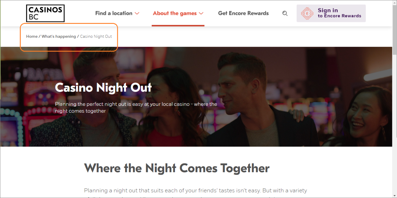
The breadcrumb component was designed to be used on orphan pages only (meaning the pages cannot be accessed via the main navigation). This is so that when a user is on a page that is a bit more "buried", they still have a sense of where they are on the website. They can also navigate away from the page using the breadcrumb to access other sections of the site. 

Examples of where the breadcrumb component is being used on the website are all Service Provider (SP) pages and pages like the Casino night out page (as they are all orphan pages not accessible from any top level navigation). 

Component options

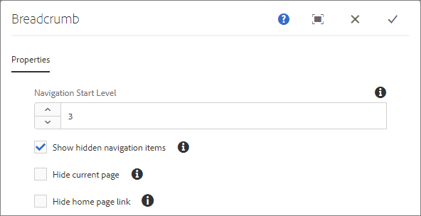
In the cms when using the breadcrumb component, there are a few options you can define on the Properties tab:

  • the navigation start level
  • to show or hide hidden navigation items
  • to show or hide the current page from the navigation
  • to show or hide the homepage link

On this page, I have specified for it to show the homepage link, the hidden navigation items and the current page and have specified it to start at level 3.

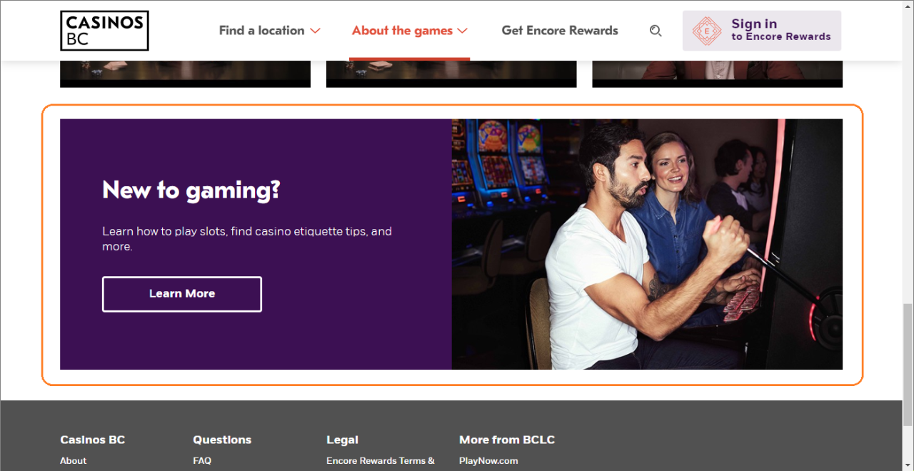
The CTA 50/50 component was designed to highlight information with text and an image. The text area is will always use the same format and design styles with a choice of on-brand background colours. It can be used to highlight or cross-promote relevant information across the website. 

It is a horizontal strip of content that is divided in half with text on one side and image on the other side.

Examples of this component being used on the website can be found on these pages:

It is a good component to use in an Experience Fragment so that it can be defined once and then used on many different pages.

Component options

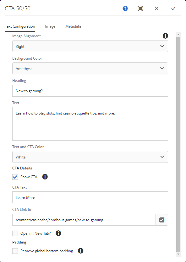
In the cms when using the CTA 50/50 component, these are the options you can define:

Text Configuration tab:

  • image position on the left or right
  • background and text colour:
    •  Ruby background + white text
    • Amethyst background + white text
    • Royal background + white text
    • Grey background + black text
    • Black background + white text
  • heading text
  • desription text (optional)
  • to show or not show CTA (button), if yes
    • CTA text
    • CTA url
    • to have CTA open in new browser window or not
  • to remove global padding from the bottom of the component or not

Image tab:

  • drag and drop the correct CTA 50/50 image from the DAM into this tab
  • image dimensions must be: 714px x 476px

Metadata tab:

  • specify whether the image is decorative or not (if it is decorative, it won't have any alt text)
  • if it is not decorative and it needs to have alt text specified, it can either use the alt text associated with the asset in the DAM or it can be specified here
  • specify the URL if the image should link to something (we don't typically use this, instead we use the CTA in the text area for the URL) 

This screenshot shows the options used to build the New to gaming CTA 50/50 used in the Casino night out example.

Columns

In order to access AEM you must first access Citrix. In order to access Citrix, you will need an RSA token.

Column components

In order to access AEM you must first access Citrix. In order to access Citrix, you will need an RSA token.

Need support?

Do you need help or have a question? Do you have a need for a new component? If so, please contact the UX Operations team.

Submit a Jira ticket